Friday, July 31, 2009

Setting Join Columns with Request Variables

Here is a technique for enabling the user to set join columns with a dashboard prompt.

An example of a case where this technique could be useful is when there are multiple date columns in a fact table. For example, a purchase order might have a purchase order date, a ship by date, and a cancel by date. The dashboard prompt would allow the user to set a date range in the period table and then determine which column in the fact table the period table would join to. By changing the join column the user changes the set of purchase orders that match the date prompt.

The technique described here may not be the only way to accomplish this, and I’d welcome any other suggestions for better techniques. But here is one that works.

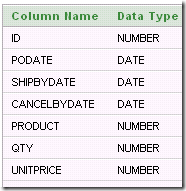
The sample fact table I’ll use is a basic representation of a purchase order line.

image

The metadata defines a non-system session variable called JoinColumn which has an initialization block with the following SQL.

select 'CANCELBYDATE' from dual

The session variable also has a default value, which is the string ‘CANCELBYDATE’. (Of course, the default value could be different, and the init block could select a different value.)

image

The metadata allows any user to “set the value” – i.e. over write the session variable value by setting a request variable with the same name. (This overwriting occurs for queries that execute on a dashboard within the scope of the dashboard prompt).

image

In the physical layer, the table is defined by a Select statement that uses ValueOf(NQ_SESSION.JoinColumn) as one of the column names. ValueOf(NQ_SESSION.JoinColumn) can become PODATE, SHIPBYDATE, or CANCELBYDATE depending on the value of the session variable JoinColumn. The SQL gives the column the alias JCol.

Select ValueOf(NQ_SESSION.JoinColumn) as JCol
, ID
, Product
, Qty
from POS

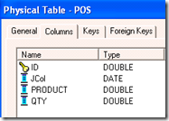
For simplicity, the column UNITPRICE is ignored here.  The table looks like this in the physical layer. Note that the data type of JCol is Date.

image image

The physical join from the period table to the fact table is straightforward – JCol joins to the DATE_ column in TIME.

image

The dashboard has a prompt that allows the user to set a date range in the TIME table as well as the value of the session variable JoinColumn.

image

To show the set up of the dashboard prompt more clearly, here are two pictures of it. The request variable name must match the name of the session variable (case sensitive).

image

image

The values of the join column show up in a drop-down list using this SQL:

SELECT case when 1=0 then TIME."MONNAME" else 'PODATE' end FROM SetJoin 
union all
SELECT case when 1=0 then TIME."MONNAME" else 'SHIPBYDATE' end FROM SetJoin 
union all
SELECT case when 1=0 then TIME."MONNAME" else 'CANCELBYDATE'end  FROM SetJoin

The default value is set to a specific value, CANCELBYDATE.

image 

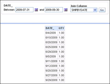
As the user makes different selections of the join column, the SQL generated matches those selections.

image

select T463.DATE_ as C1
,Sum(T946.QTY) as C2
from time T463
,(select CANCELBYDATE as JCOL
,id
,PRODUCT
,QTY
from POS) T946
where (T463.DATE_ = T946.JCOL
and T463.DATE_ between To_date('2009-07-31','YYYY-MM-DD') and To_date('2009-09-30','YYYY-MM-DD')
and T946.JCOL between To_date('2009-07-31','YYYY-MM-DD') and To_date('2009-09-30','YYYY-MM-DD'))
group by T463.DATE_
order by C1

image

select T463.DATE_ as C1
,Sum(T946.QTY) as C2
from time T463
,(select SHIPBYDATE as JCOL
,id
,PRODUCT
,QTY
from POS) T946
where (T463.DATE_ = T946.JCOL
and T463.DATE_ between To_date('2009-07-31','YYYY-MM-DD') and To_date('2009-09-30','YYYY-MM-DD')
and T946.JCOL between To_date('2009-07-31','YYYY-MM-DD') and To_date('2009-09-30','YYYY-MM-DD'))
group by T463.DATE_
order by C1

Monday, July 27, 2009

Need Selected Date + 30 days data

Someone asked a question on a “Siebel Analytics” email group a few days ago that I thought was worth discussing briefly here. The question posed was how to put a date prompt on a dashboard and return data for that date and the next 30 days. The solution could not involve presentation or report variables, since these were introduced only in a later version of Siebel Analytics that the person who posed the question did not have.

When you have a problem like this, it usually helps to think about the SQL the BI Server would need to generate. In this case, it would include a WHERE clause with a BETWEEN predicate. That is, the normal key/foreign key equijoin between the fact table and the period table would have to become a join of the fact table  foreign key between a date in the period table and that date plus 30 days. This is a good example or a key principle: whenever a join condition needs to change, you should think about creating a new alias that uses that join condition.

Here’s an example of the usual equijoin of the period table (“TIME”) to the fact table (“TIMECOMPAREFACTS”).

image

Using an alias of the fact table (“TimeSpanFacts”) and a“complex” instead of a physical foreign key join, the join expression changes.

image

Now the user picks a date with the dashboard prompt and clicks Go.

image

The BI Server generates the SQL needed as specified in the metadata.

select T463.DATE_ as C1
,Sum(T884.QS) as C2
,Sum(T884.DOLLARS) as C3
from TIME  T463
, TIMECOMPAREFACTS T884 /* TimeSpanFacts */
where
(
T463.DATE_ = To_date('2009-04-01','YYYY-MM-DD')
and
T884.DATEKEY between T463.DATE_ and (T463.DATE_ + 30)
)
group by T463.DATE_
order by C1

Sunday, July 19, 2009

Comparing Arbitrary Time Periods

The Ago() “time series function” can be used to show data for a  previous time period, as long as the previous time period corresponds to a level that has been defined in the period hierarchy. A typical period hierarchy containing day, month, quarter, and year levels would allow you to use the Ago function to construct measures showing data for day ago, month ago, quarter ago, year ago (or N days ago, N months ago, etc.).

However, sometimes there is the need to compare facts in arbitrary time periods. For example, if an analyst wanted to compare sales from March 19 to March 23 2008 with sales during the period March 30 to April 12 2009 (not entirely fanciful – these were the two weeks before Easter in the United States in 2008 and 2009), the Ago function is not a solution.

In addition, use of the Ago function requires you to define separate measures for all levels, Ns, and base measure combinations that you might want to use. So if you had the base measures Quantity Sold and Amount Sold you could end up with separate measures for Quantity Sold Week Ago, Quantity Sold 2 Weeks Ago, Quantity Sold 3 Weeks Ago, …, Quantity Sold Month Ago, Quantity Sold 2 Months Ago, …, Quantity Sold Year Ago, Quantity Sold 2 Years Ago, …  and the same for Amount Sold and every other base measure. In addition, you might define variances or % Change measures around each of these combinations – i.e. Quantity Sold % Change vs. Week Ago, vs. 2 Weeks Ago, vs. 3 Weeks Ago, ….

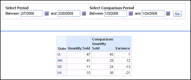
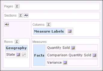
This post is about designing a dashboard page that provides an easy way for users to select an arbitrary time period and an arbitrary comparison time period and have the measures aggregated over those two time periods along with variance or % Change calculations.  The basic functionality would look like this to the user. The user sets values in a dashboard prompt for the base period (for example,  2/7/2009 through 2/28/2009). Then he/she selects the comparison period (for example, 1/3/2009 through 1/24/2009. Then he/she clicks the Go button in the prompt.

image

Or the user could compare the period from 3/1/2009 through 3/18/2009 with the period from 2/8/2009 through 2/28/2009.

image

There are several approaches you might think of to provide a working solution. I’ll discuss two here, but there might be others.

The first involves creating two separate queries that have two different time constraints, unioning the results together, and then combining results using a pivot table.

There are some downsides to using a union, because with a union you give up navigation, you give up column selectors, you give up calculating a % Change, and you will have some  deficiencies with charts. The upside is it needs only a simple change in the metadata.

Using A Union (“Combining Similar Queries”)

This approach seems to work best if you create a second presentation column to enable setting two period constraints in a dashboard prompt.

image

Build a dashboard prompt having both “Date” and “Comparison Date” using the “is between” Operator with both.

image

Construct the first query using “Date is prompted”.

image

The column formulas are
Geography.State,
Facts.”Quantity Sold”,
0, 
Facts.”Quantity Sold”.

Click “Combine Similar Queries” and construct the second query(you can take a shortcut here by copying the original query). In the second query, change the filter to use the Comparison Date column.

image

The column formulas in the second query are Geography.State,
0,
Facts.”Quantity Sold”,
-Facts.”Quantity Sold”.

When you run the query (no constraints having yet been set on dates), you end up with something like this:

image

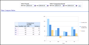
Then use the pivot table view to sum up the columns, grouping by the common non-aggregatable column values. Be sure to set the aggregation rule for each fact column (aggregation = sum).image

If you want to chart the results, you may need to use the pivot table chart view.

image

This is how it looks on the dashboard after date values have been entered.

image

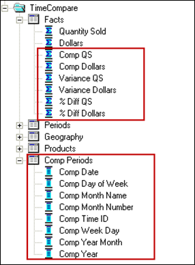
Second Period Dimension and Fact Table Alias

Another approach is to introduce a second period dimension and an alias of the fact table. This requires more metadata work but you end up getting back all the features you forego with unions. Unions (and the other set operation queries using intersect and minus operators) were supposed to become “first class query citizens” several years ago, but have not made it (yet). In the meantime, we need to find other approaches. The steps are outlined here.

Create new aliases of the period table and fact table.image
Create physical joins. The table TIMECOMPAREPRODUCTS and TIMECOMPAREGEOG were the existing product and geography tables.
image
Add the second period table to the business model, including the logical joins.
image 
Add a second period dimension to the business model.
 image
Add a new logical fact table source.
image 
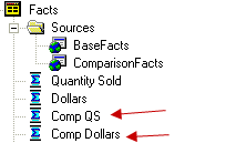
Create new comparison base measures and map them into comparison logical fact table source.
image
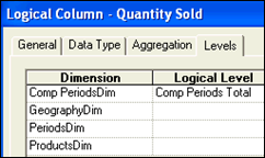
Because the new period dimension does not relate to all facts (nor, now, does the old period dimension) , set the level attributes of the base and comparison measures to the Total level for the dimension that does not relate to them.

image image 
More than likely, you will want to create variance and % Change measures.
image
Add the new objects to the presentation layer.

image

You can now create dashboard pages that support arbitrary time comparisons along with regular navigation and drilling. Combining this with column selectors, the dashboard page gives users a lot of latitude to do the analyses they need without using Answers.
image

Put something like this together and, if you are curious,  see how simple the resulting SQL is compared to what happens with the Ago function!

Saturday, July 11, 2009

Visually Presenting Data in Tables and Pivot Tables

There are times when you might want to visually present data directly in tables or pivot tables rather than create a chart view. For example, you may have too many values to show in a chart. Or the number of values returned by the query might vary, making the size of the chart sometimes too small to accommodate them all, sometimes too large. Or you may want to visually scroll up and down a table to compare values and would like a visual representation right there in the table.

This posting will present two ways to do that.

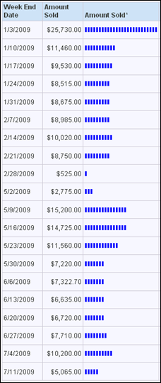
Here’s an example of data that we would like to represent visually.

image

A quick and easy visualization can be done using the text Repeat function.  The formula here will repeat the upper case “I” character as many times as there are thousands in the Amount Sold column.

repeat('I', case when "Sell Through Facts"."Amount Sold" is null then 0 else cast(round("Sell Through Facts"."Amount Sold"/1000,0) as integer) end )

image

You can easily change the format of the resulting text to get the look you want. For example, here is the  format that produces the visualization below.

image

image

The formula casts to integer in order to avoid the following error message.

image

A second way to do this is to use the Google chart API to draw a horizontal bar chart. Google’s API can produce a variety of chart types including bar, horizontal bar, pie, and line. Using a line chart in the right place can be especially powerful.

The simplest way to use Google, in my opinion, is first of all to normalize the data as a percentage of the maximum value in the result set.

image

The second step is to create another column using a formula that will generate a URL that conforms to the parameters in the Google chart API. The first part of the formula, represented here in yellow, is text that sets chart type, size, and color. The part after that is the data. The Cast converts the normalized data to text and Replace removes any “.” characters.

image

Here’s the text of the formula.

'http://chart.apis.google.com/chart?cht=bhs&chs=100x20&chco=4d89f9&chd=t:'||replace( trim(cast(ifnull(100*"Sell Through Facts"."Amount Sold"/max("Sell Through Facts"."Amount Sold"),0) as char(3))),'.','')

Set the Data Format to treat text as an Image URL.

image

The result looks like this.

image

Google charts are described at http://code.google.com/apis/chart/

There you can find all the details you need to change colors, sizes, and chart types. Google’s API integrates very nicely with OBIEE.  Here’s the same data, represented as vertical bar charts in a pivot table. You can see that this technique gives you a way to visualize trends very easily.

image

Friday, July 10, 2009

Groups, Webgroups, and Delivers

I thought it would be worth exploring the interrelated topics of repository groups, web groups, system session variables,  Delivers, the SA System subject area, and My Account. 

First comment: I am not sure that anyone knows any more, if they ever did, how all these things are actually supposed to interrelate. The best we can do is try things, see what happens, and learn from experiment and experience.

To that end, I created the table Users1 with information about  four users, including their BI server (RPD) group and presentation server (Web) group memberships. My practice is to not use the same names for BI server groups and presentation server groups.  (Things get confusing rapidly if you do that, in my opinion). This is the content of the table:

image

User authentication occurs via an initialization block called “Authenticate”. The SQL of the Authenticate init block is:

Select
Logon
, Displayname
, RPDGroup
, Webgroup
from
Users1
where
upper(Logon) = upper(':USER')
NQS_PASSWORD_CLAUSE(and password =':PASSWORD')NQS_PASSWORD_CLAUSE

The session variables populated by this init block are

image

There are a couple of basic things to know here.  :USER is the user ID entered by the user in the logon screen (or passed to the BI Server by some external authentication system, such as Oracle SSO). :PASSWORD is the password entered by the user. Both of these have to be typed in upper case in the SQL.  Note: Enclosing the constraint on password with NQS_PASSWORD_CLAUSE as shown in the SQL above is required with Delivers. If your system uses SSO to authenticate users, then remove the password constraint from the init block completely.

The session variables to be populated by the init block have to be in the same order as the columns in the SQL. Variable population depends on the order only, not in matching the names of the columns to the names of the variables. NOTE : because order of the variables is the only thing that matters, beware that sometimes, spontaneously it seems, the order of variables can change. If this occurs, break up your init block into multiple init blocks until the order of variables remains stable.

The variables names used here are special system session variables. Note: The variable “GROUP”  is singular, but you can assign a user to multiple groups in the init block. “WEBGROUPS” is plural. If you enter “WEBGROUP” (singular) the init block will not assign users to web groups.

In the Users1 table, users are being assigned to multiple groups and web groups with group and webgroup names separated by semi-colons. (Another way to do this would be to populate GROUP or WEBGROUPS variables using  row-wise initialization. As far as I can tell, both methods work the same in all respects.)

To illustrate how this works, let’s use an example RPD having five presentation catalogs.

image

BI Server group “GroupA” has access to Retail Data A. GroupB has access to Retail Data B, etc.  The table User1 puts A in GroupA and GroupB. Here’s what A sees in Answers.

 image

If A goes to My Account in the web UI, it shows that A is a member of the web group  WebA.

image

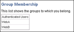
User B logs in and also sees Retail Data A and Retail Data B, since B is also a member of GroupA and GroupB. My Account shows B belongs to web groups WebA and WebB.
image

User C logs in, sees three subject areas, and is a member of three web groups.

image  image

At this point in time, users A, B, and C have logged in but user D has not. Now the administrator user logs in and examines the list of users and groups in the Administration UI in the web. Here’s what the administrator sees: users A, B, and C are listed as users.

image

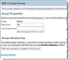
If Administrator looks at who is a member of WebA, however, no one is listed.
image

The user’s name persists once the user logs in,  but the web group membership appears not to.

In Delivers, you can name a web group as a recipient of an alert. What happens when the alert is addressed to members of WebA at this point? Since WebA has no members, there are no recipients. Users A, B, and C will not receive the alert. If  the administrator tries to add A, B, and C to WebA, he will see this.

image 

In this context, the web catalog appears to remember that A, B, and C have been assigned to WebA, and it is not possible for the Administrator to add them.  Now suppose User D logs in.  He now becomes a listed Catalog User and a member of WebD, as shown on his My Account page.

image

Now if Administrator logs in and attempts to add users to WebA, this is what he sees.

image

D, who has not been a member of WebA, can be added, but not A, B, or C. Suppose the administrator adds D to WebA.

image

When D logs in and goes to the My Account page, it shows his group membership includes WebA and WebD.image

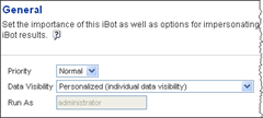
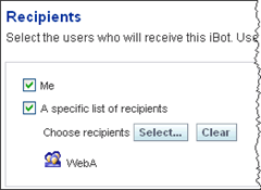
Now suppose the Administrator creates an iBot using the subject area Retail Data A with Personalized data visibility and chooses the group WebA as a recipient.
image

image

When User D logs in he will not see the alert.

image

The reason is that only members of the repository group GroupA have access to the subject area Retail Data A. When the Administrator modifies the data visibility setting of the alert so that it is Not Personalized and is run as the Administrator user, User D will receive the alert.

image

image
image

User A is a member of GroupA, therefore has access to the subject area Retail Data A. When A logs in, he doesn’t see the alert notification, since A is not an explicit member of Web Group A – he is a member by virtue of the value of the WEBGROUPS session variable.

image 

However, when he clicks on More Products|Delivers|Show iBots Acting On My Behalf, the alert is listed. It’s listed as acting on his behalf but, apparently, he won’t receive the contents of the iBot!

image

By the way, clicking on the iBot link, “QS Alert”, only shows the settings of the iBot, not the contents.

image

Even if A is logged on at the time the iBot is running, he will not see the iBot alert.

What about the “SA System” subject area? The basic purpose of SA System is to set the delivery profiles of users, providing default delivery settings for users who have not entered settings in My Account. (SA System can also overwrite user settings in My Account if a parameter to do that is set in instanceconfig.xml).

In this example, SA System columns are mapped  to columns in the Users1 table or to string constants in the metadata for logical columns Email, Email Type, Email Priority, Cell Phone, and Cell Phone Priority.

image

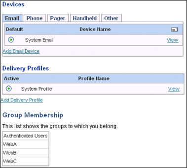
When UserC, who has not set up and devices or delivery profiles, views My Account settings, he sees a System Email device and a System Profile.
image

These conform to the settings from SA System.

image

image

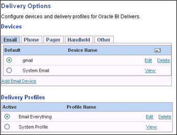
When A views My Account, he sees the settings from SA System, but they are not active, since A has defined his own settings.
image

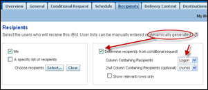
There is a way to get Delivers to deliver content to all members of WebA, however. Set up another request (it could use the SA System subject area, but it doesn’t have to) that will return the members of WebA. Then make this request the conditional request for the iBot.

The following query was saved as “Deliver to WebA”.image

This query was specified as the conditional request in the iBot.

image 

The Recipients tab was set to determine recipients from the conditional request.
image 

The Delivery Content tab is where the query that generated content was specified.

image

The iBot was fired off. When user A logged in, this time he saw the alert.

image

However, the shortcoming here is that you cannot deliver personalized results. Suppose there are filters on Groups A, B, and C when querying Retail Data A. GroupA sees only Product A, GroupB sees only ProductB, and GroupC sees only ProductC.

UserA and UserB are members of both GroupA and GroupB. Their results include both Product A and Product B.

image

Members of Group C (which User C belongs to)  see only Product C.
image.

An iBot that has a conditional request (“Deliver to WebA”), specific named recipients (Users A, B, and C), and personalized data visibility does not get delivered.

image

After modifying this iBot so that the conditional request is the same as the content (the query “QS” is used for both), Users A, B, and C receive the iBot with personalized content.

image

So where are we? It would be nice to be able to assign users to web groups using session variables, to send iBots to those users by specifying groups as recipients, and to personalize the content of the iBots. It seems as though there ought to be a way to do all this, but the pieces in OBIEE don’t really seem to fit together at this time. Depending on what you want to achieve, you may need to use a variety of methods to configure iBots and deliver alerts.

.